Challenge
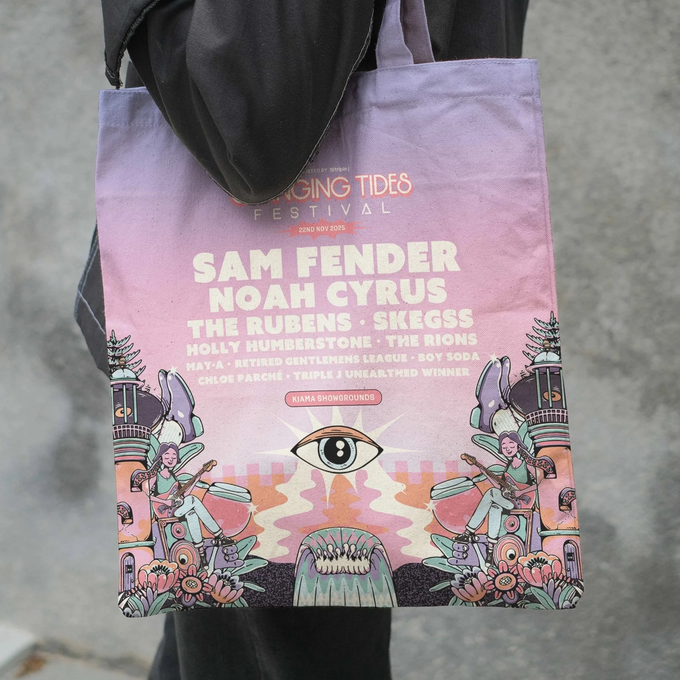
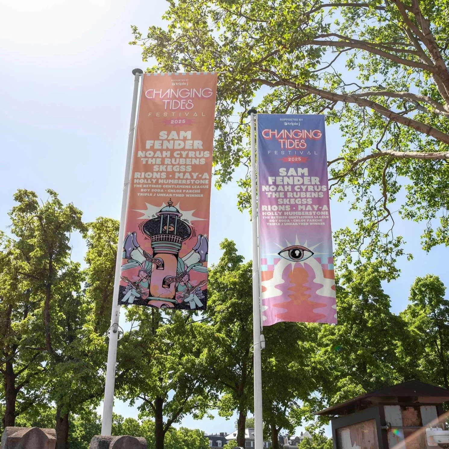
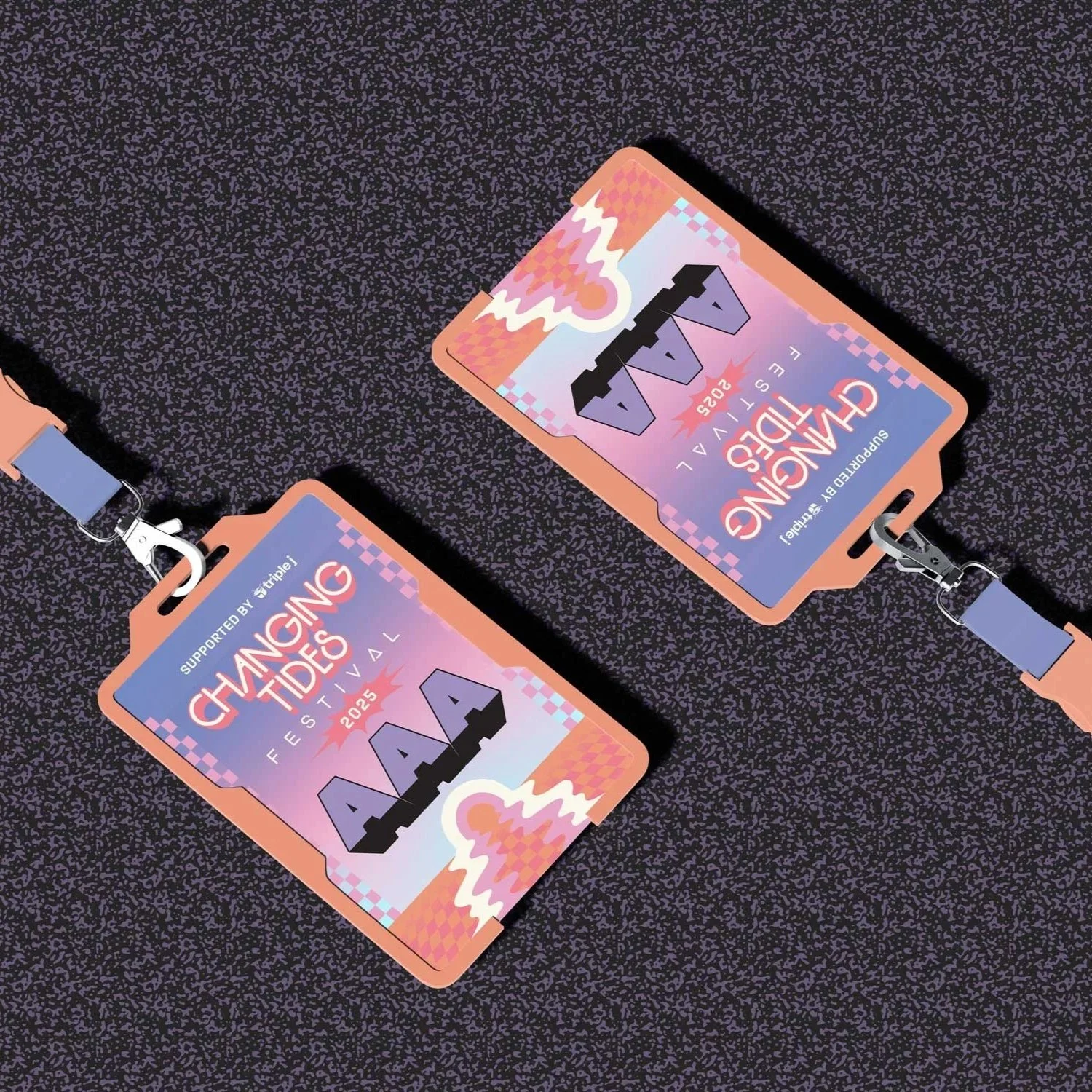
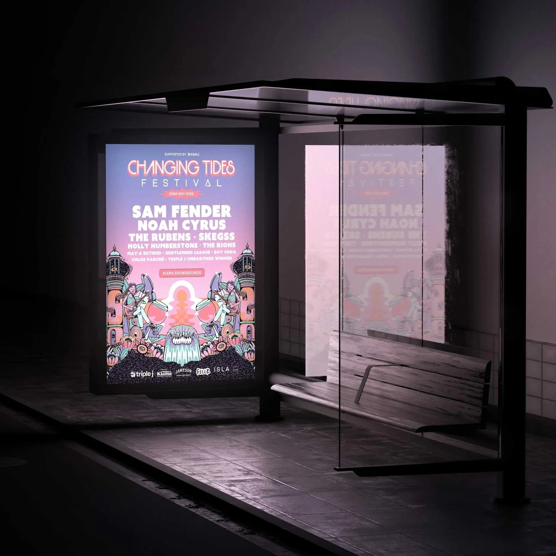
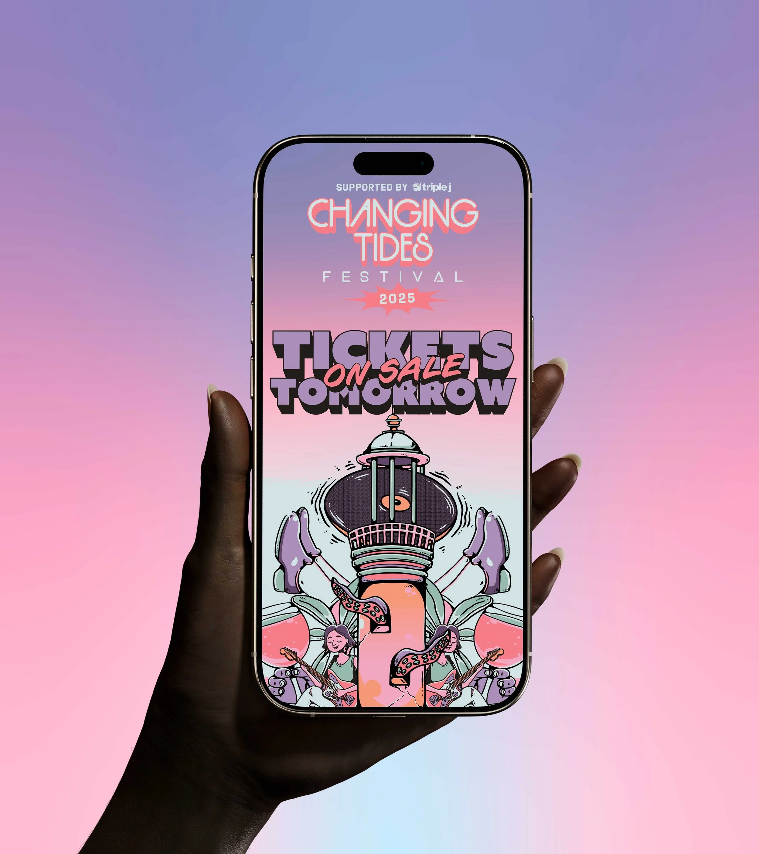
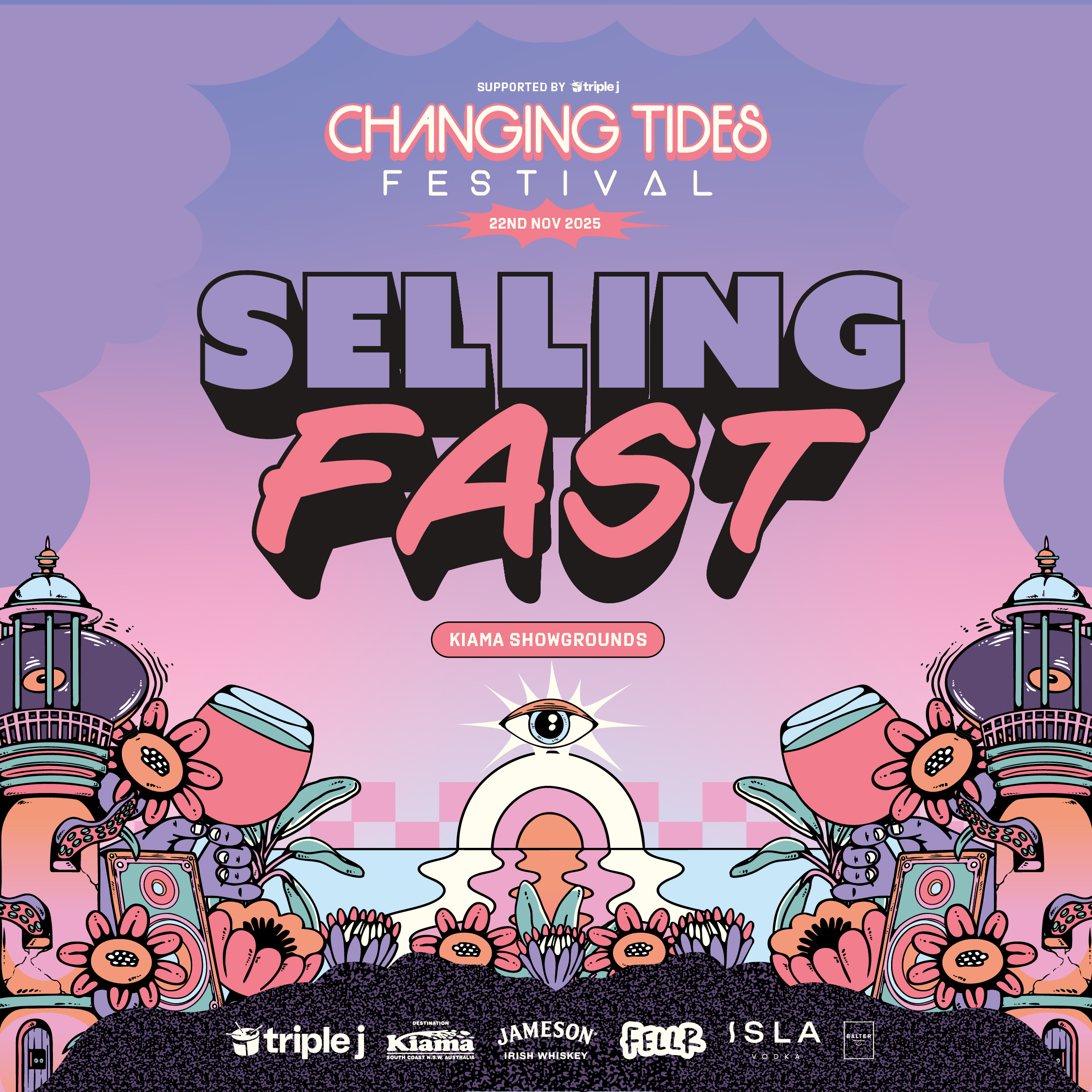
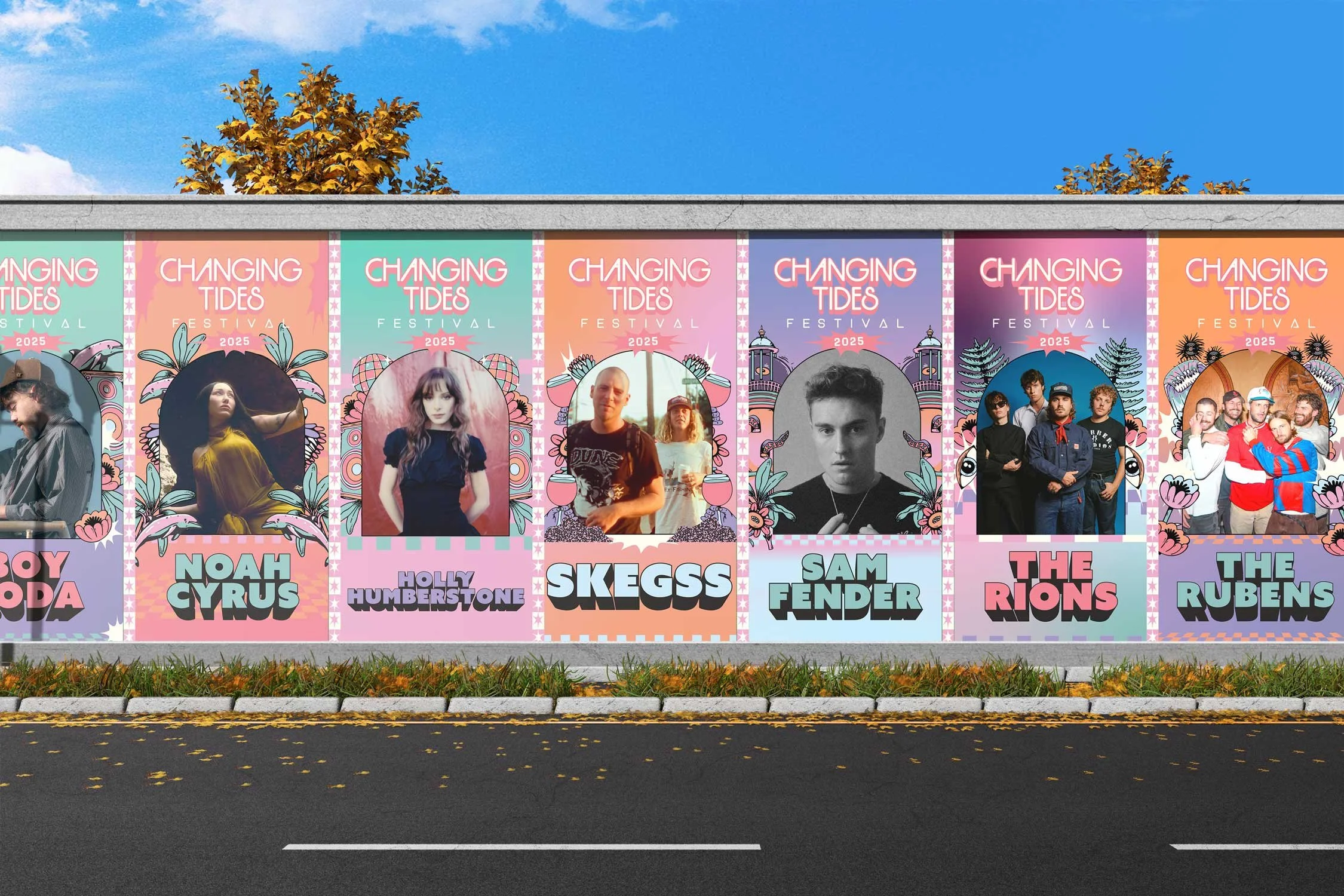
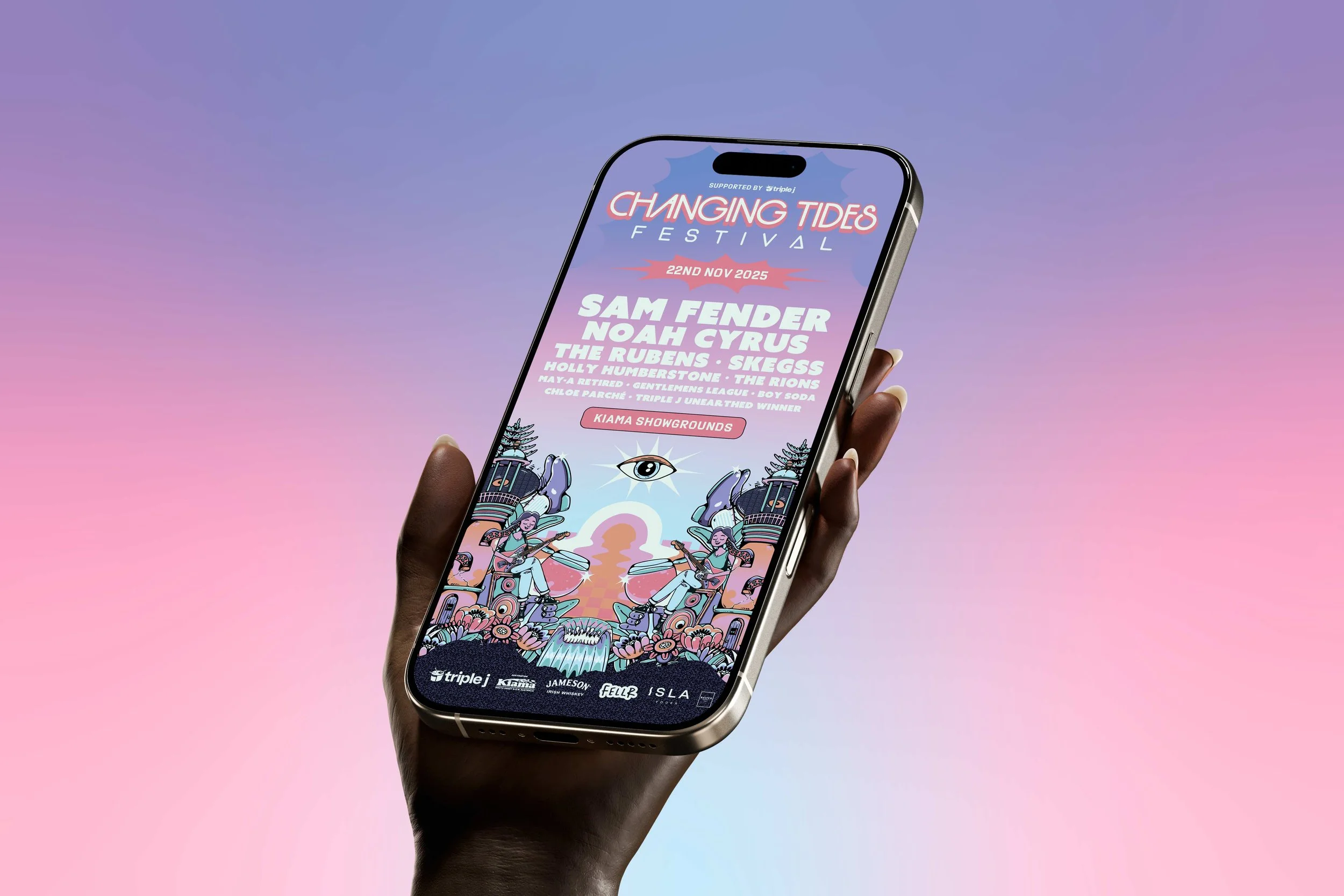
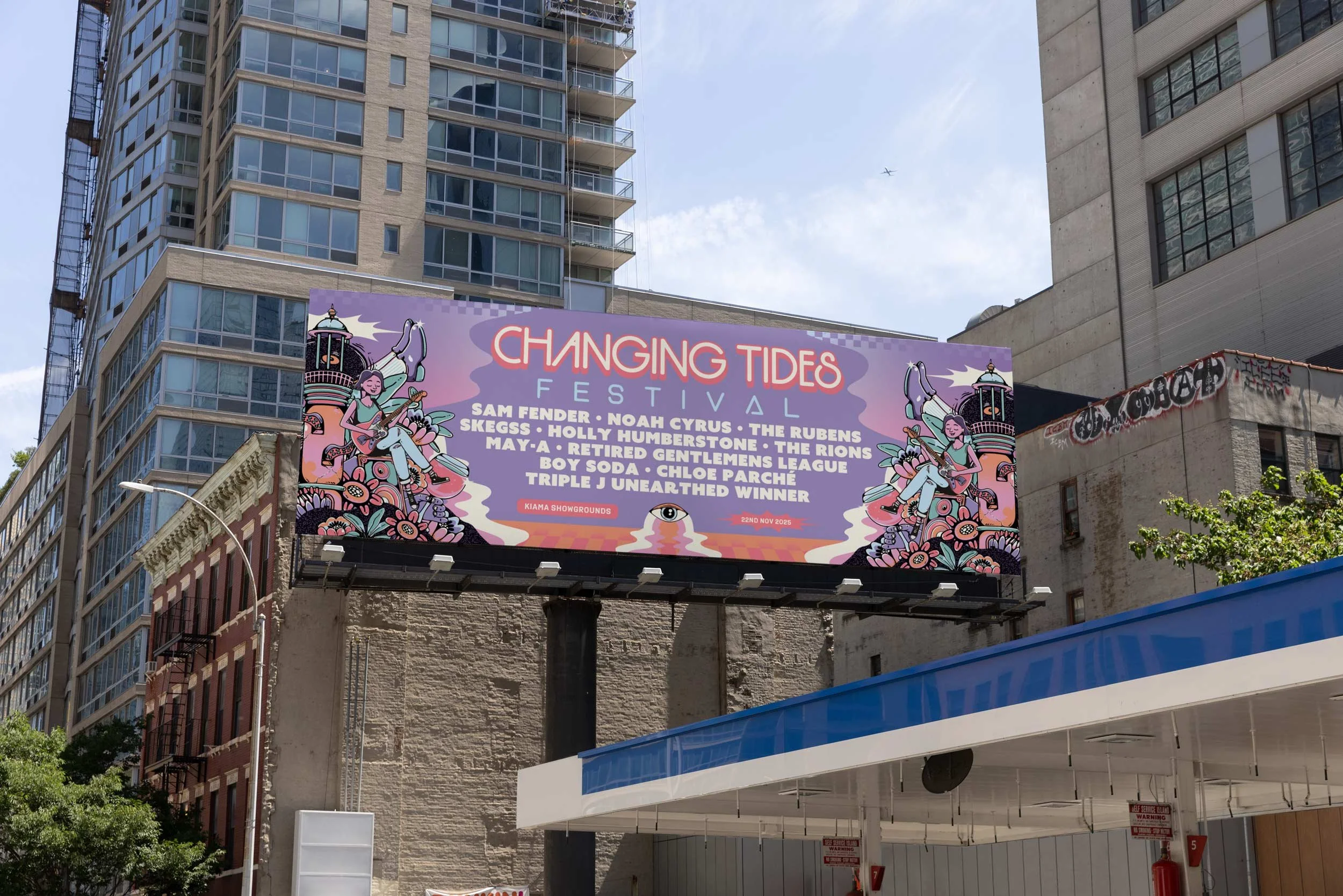
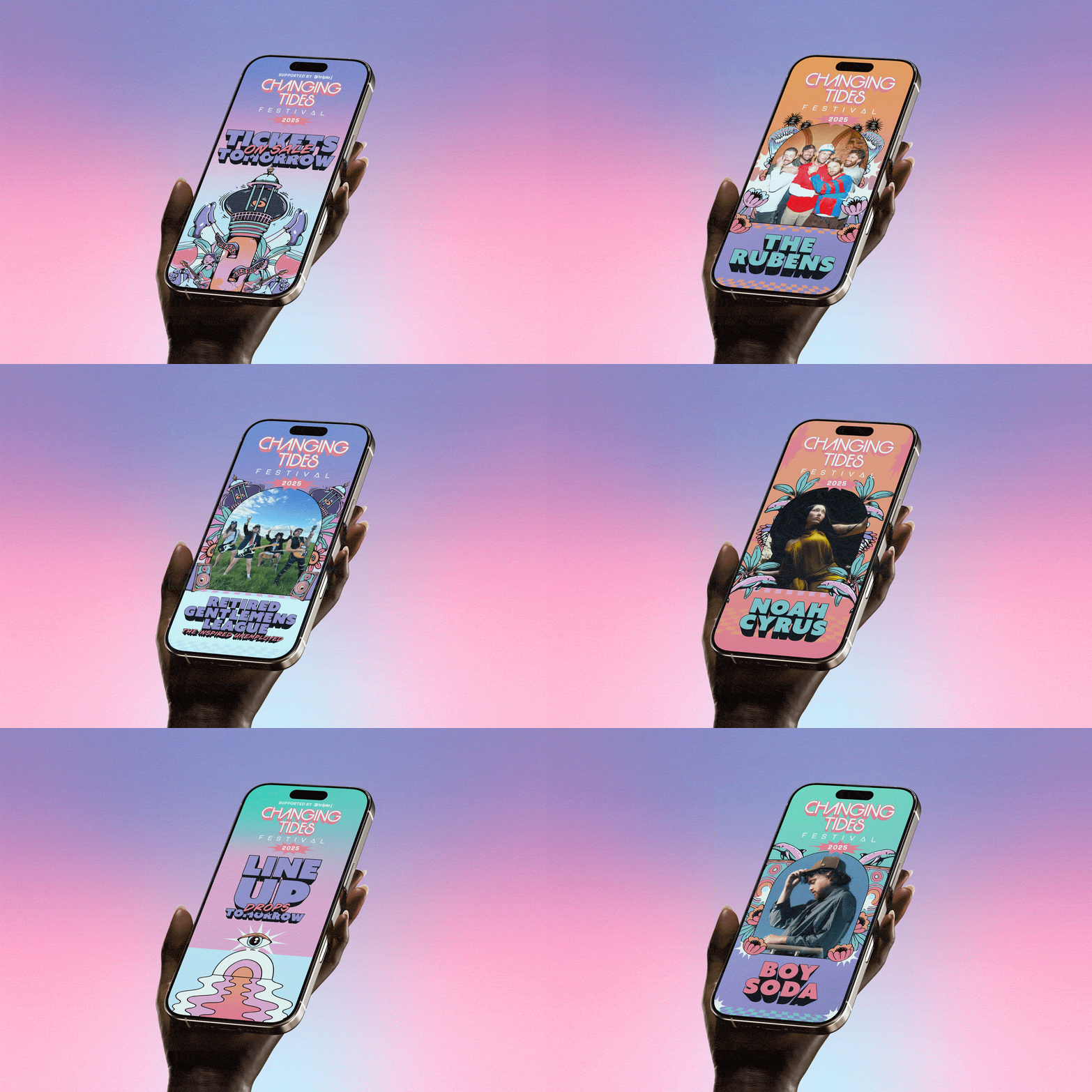
Changing Tides needed a visual identity that could hold its own against major international festival brands, while still feeling like a genuine, community-rooted celebration of Kiama and the NSW South Coast. The brand also had to flex across a huge range of touchpoints — from lanyards and tote bags to billboards, bus shelters and social — without losing a consistent, recognisable voice.
Solution
We built an illustrative brand world drawing on the ebb and flow of the tides themselves — fluid linework, a vibrant coastal palette and custom artwork that felt equally at home on a festival flag or a an iphone. The system was designed to scale from small print items, digital hand held devices to large format outdoor printing , giving Changing Tides a cohesive identity that helped carry the festival through two consecutive years.
Delivery
Branding
Signage
Art Direction
Merchandise
Illustration
Packaging
Social Media